-
Hakim El Hattab authored
Fixes #2268
Hakim El Hattab authoredFixes #2268

reveal.js 

A framework for easily creating beautiful presentations using HTML. Check out the live demo.
reveal.js comes with a broad range of features including nested slides, Markdown support, PDF export, speaker notes and a JavaScript API. There's also a fully featured visual editor and platform for sharing reveal.js presentations at slides.com.
Supporting reveal.js
This project was started and is maintained by @hakimel with the help of many contributions from the community. The best way to support the project is to become a paying member of Slides.com—the reveal.js presentation platform that Hakim is building.
Table of contents
- Online Editor
- Installation
- Instructions
- Configuration
- Presentation Size
- Dependencies
- Ready Event
- Auto-Slide
- Auto-Animate
- Keyboard Bindings
- Vertical Slide Navigation
- Touch Navigation
- Lazy Loading
-
API
- Custom Key Bindings
- Slide Changed Event
- Presentation State
- Slide States
- Slide Backgrounds
- Parallax Background
- Slide Transitions
- Internal links
- Fragments
- Fragment events
- Code syntax highlighting
- Slide number
- Overview mode
- Fullscreen mode
- Embedded media
- Stretching elements
- Resize Event
- postMessage API
- PDF Export
- Theming
- Speaker Notes
- Plugins
- Multiplexing
- MathJax
- License
More reading
- Changelog: Up-to-date version history.
- Examples: Presentations created with reveal.js, add your own!
- Browser Support: Explanation of browser support and fallbacks.
- Plugins: A list of plugins that can be used to extend reveal.js.
Online Editor
Presentations are written using HTML or Markdown but there's also an online editor for those of you who prefer a graphical interface. Give it a try at https://slides.com.
Installation
The basic setup is for authoring presentations only. The full setup gives you access to all reveal.js features and plugins such as speaker notes as well as the development tasks needed to make changes to the source.
Basic setup
The core of reveal.js is very easy to install. You'll simply need to download a copy of this repository and open the index.html file directly in your browser.
- Download the latest version of reveal.js from https://github.com/hakimel/reveal.js/releases
- Unzip and replace the example contents in index.html with your own
- Open index.html in a browser to view it
Full setup
Some reveal.js features, like external Markdown and speaker notes, require that presentations run from a local web server. The following instructions will set up such a server as well as all of the development tasks needed to make edits to the reveal.js source code.
-
Install Node.js (9.0.0 or later)
-
Clone the reveal.js repository
$ git clone https://github.com/hakimel/reveal.js.git -
Navigate to the reveal.js folder
$ cd reveal.js -
Install dependencies
$ npm install -
Serve the presentation and monitor source files for changes
$ npm start -
Open http://localhost:8000 to view your presentation
You can change the port by using
npm start -- --port=8001.
Folder Structure
- css/ Core styles without which the project does not function
- js/ Like above but for JavaScript
- plugin/ Components that have been developed as extensions to reveal.js
- lib/ All other third party assets (JavaScript, CSS, fonts)
Instructions
Markup
Here's a barebones example of a fully working reveal.js presentation:
<html>
	<head>
		<link rel="stylesheet" href="css/reveal.css">
		<link rel="stylesheet" href="css/theme/white.css">
	</head>
	<body>
		<div class="reveal">
			<div class="slides">
				<section>Slide 1</section>
				<section>Slide 2</section>
			</div>
		</div>
		<script src="js/reveal.js"></script>
		<script>
			Reveal.initialize();
		</script>
	</body>
</html>
The presentation markup hierarchy needs to be .reveal > .slides > section where the section represents one slide and can be repeated indefinitely. If you place multiple section elements inside of another section they will be shown as vertical slides. The first of the vertical slides is the "root" of the others (at the top), and will be included in the horizontal sequence. For example:
<div class="reveal">
	<div class="slides">
		<section>Single Horizontal Slide</section>
		<section>
			<section>Vertical Slide 1</section>
			<section>Vertical Slide 2</section>
		</section>
	</div>
</div>
Markdown
It's possible to write your slides using Markdown. To enable Markdown, add the data-markdown attribute to your <section> elements and wrap the contents in a <textarea data-template> like the example below. You'll also need to add the plugin/markdown/marked.js and plugin/markdown/markdown.js scripts (in that order) to your HTML file. Note: both these dependencies are included on line 35 of default index.html.
This is based on data-markdown from Paul Irish modified to use marked to support GitHub Flavored Markdown. Sensitive to indentation (avoid mixing tabs and spaces) and line breaks (avoid consecutive breaks).
<section data-markdown>
	<textarea data-template>
		## Page title

		A paragraph with some text and a [link](http://hakim.se).
	</textarea>
</section>
External Markdown
You can write your content as a separate file and have reveal.js load it at runtime. Note the separator arguments which determine how slides are delimited in the external file: the data-separator attribute defines a regular expression for horizontal slides (defaults to ^\r?\n---\r?\n$, a newline-bounded horizontal rule) and data-separator-vertical defines vertical slides (disabled by default). The data-separator-notes attribute is a regular expression for specifying the beginning of the current slide's speaker notes (defaults to notes?:, so it will match both "note:" and "notes:"). The data-charset attribute is optional and specifies which charset to use when loading the external file.
When used locally, this feature requires that reveal.js runs from a local web server. The following example customises all available options:
<section data-markdown="example.md"
         data-separator="^\n\n\n"
         data-separator-vertical="^\n\n"
         data-separator-notes="^Note:"
         data-charset="iso-8859-15">
    <!--
        Note that Windows uses `\r\n` instead of `\n` as its linefeed character.
        For a regex that supports all operating systems, use `\r?\n` instead of `\n`.
    -->
</section>
Element Attributes
Special syntax (through HTML comments) is available for adding attributes to Markdown elements. This is useful for fragments, amongst other things.
<section data-markdown>
	<script type="text/template">
		- Item 1 <!-- .element: class="fragment" data-fragment-index="2" -->
		- Item 2 <!-- .element: class="fragment" data-fragment-index="1" -->
	</script>
</section>
Slide Attributes
Special syntax (through HTML comments) is available for adding attributes to the slide <section> elements generated by your Markdown.
<section data-markdown>
	<script type="text/template">
	<!-- .slide: data-background="#ff0000" -->
		Markdown content
	</script>
</section>
Configuring marked
We use marked to parse Markdown. To customise marked's rendering, you can pass in options when configuring Reveal:
Reveal.initialize({
	// Options which are passed into marked
	// See https://marked.js.org/#/USING_ADVANCED.md#options
	markdown: {
		smartypants: true
	}
});
Configuration
At the end of your page you need to initialize reveal by running the following code. Note that all configuration values are optional and will default to the values specified below.
Reveal.initialize({

	// Display presentation control arrows
	controls: true,

	// Help the user learn the controls by providing hints, for example by
	// bouncing the down arrow when they first encounter a vertical slide
	controlsTutorial: true,

	// Determines where controls appear, "edges" or "bottom-right"
	controlsLayout: 'bottom-right',

	// Visibility rule for backwards navigation arrows; "faded", "hidden"
	// or "visible"
	controlsBackArrows: 'faded',

	// Display a presentation progress bar
	progress: true,

	// Display the page number of the current slide
	slideNumber: false,

	// Add the current slide number to the URL hash so that reloading the
	// page/copying the URL will return you to the same slide
	hash: false,

	// Push each slide change to the browser history. Implies `hash: true`
	history: false,

	// Enable keyboard shortcuts for navigation
	keyboard: true,

	// Enable the slide overview mode
	overview: true,

	// Vertical centering of slides
	center: true,

	// Enables touch navigation on devices with touch input
	touch: true,

	// Loop the presentation
	loop: false,

	// Change the presentation direction to be RTL
	rtl: false,

	// See https://github.com/hakimel/reveal.js/#navigation-mode
	navigationMode: 'default',

	// Randomizes the order of slides each time the presentation loads
	shuffle: false,

	// Turns fragments on and off globally
	fragments: true,

	// Flags whether to include the current fragment in the URL,
	// so that reloading brings you to the same fragment position
	fragmentInURL: false,

	// Flags if the presentation is running in an embedded mode,
	// i.e. contained within a limited portion of the screen
	embedded: false,

	// Flags if we should show a help overlay when the questionmark
	// key is pressed
	help: true,

	// Flags if speaker notes should be visible to all viewers
	showNotes: false,

	// Global override for autoplaying embedded media (video/audio/iframe)
	// - null: Media will only autoplay if data-autoplay is present
	// - true: All media will autoplay, regardless of individual setting
	// - false: No media will autoplay, regardless of individual setting
	autoPlayMedia: null,

	// Global override for preloading lazy-loaded iframes
	// - null: Iframes with data-src AND data-preload will be loaded when within
	//   the viewDistance, iframes with only data-src will be loaded when visible
	// - true: All iframes with data-src will be loaded when within the viewDistance
	// - false: All iframes with data-src will be loaded only when visible
	preloadIframes: null,

	// Can be used to globally disable auto-animation
	autoAnimate: true,

	// Optionally provide a custom element matcher that will be
	// used to dictate which elements we can animate between.
	autoAnimateMatcher: null,

	// Default settings for our auto-animate transitions, can be
	// overridden per-slide or per-element via data arguments
	autoAnimateEasing: 'ease',
	autoAnimateDuration: 1.0,
	autoAnimateUnmatched: true,

	// CSS properties that can be auto-animated. Position & scale
	// is matched separately so there's no need to include styles
	// like top/right/bottom/left, width/height or margin.
	autoAnimateStyles: [
		'opacity',
		'color',
		'background-color',
		'padding',
		'font-size',
		'line-height',
		'letter-spacing',
		'border-width',
		'border-color',
		'border-radius',
		'outline',
		'outline-offset'
	],

	// Number of milliseconds between automatically proceeding to the
	// next slide, disabled when set to 0, this value can be overwritten
	// by using a data-autoslide attribute on your slides
	autoSlide: 0,

	// Stop auto-sliding after user input
	autoSlideStoppable: true,

	// Use this method for navigation when auto-sliding
	autoSlideMethod: Reveal.navigateNext,

	// Specify the average time in seconds that you think you will spend
	// presenting each slide. This is used to show a pacing timer in the
	// speaker view
	defaultTiming: 120,

	// Specify the total time in seconds that is available to
	// present.  If this is set to a nonzero value, the pacing
	// timer will work out the time available for each slide,
	// instead of using the defaultTiming value
	totalTime: 0,

	// Specify the minimum amount of time you want to allot to
	// each slide, if using the totalTime calculation method.  If
	// the automated time allocation causes slide pacing to fall
	// below this threshold, then you will see an alert in the
	// speaker notes window
	minimumTimePerSlide: 0,

	// Enable slide navigation via mouse wheel
	mouseWheel: false,

	// Hide cursor if inactive
	hideInactiveCursor: true,

	// Time before the cursor is hidden (in ms)
	hideCursorTime: 5000,

	// Hides the address bar on mobile devices
	hideAddressBar: true,

	// Opens links in an iframe preview overlay
	// Add `data-preview-link` and `data-preview-link="false"` to customise each link
	// individually
	previewLinks: false,

	// Transition style
	transition: 'slide', // none/fade/slide/convex/concave/zoom

	// Transition speed
	transitionSpeed: 'default', // default/fast/slow

	// Transition style for full page slide backgrounds
	backgroundTransition: 'fade', // none/fade/slide/convex/concave/zoom

	// Number of slides away from the current that are visible
	viewDistance: 3,

	// Number of slides away from the current that are visible on mobile
	// devices. It is advisable to set this to a lower number than
	// viewDistance in order to save resources.
	mobileViewDistance: 2,

	// Parallax background image
	parallaxBackgroundImage: '', // e.g. "'https://s3.amazonaws.com/hakim-static/reveal-js/reveal-parallax-1.jpg'"

	// Parallax background size
	parallaxBackgroundSize: '', // CSS syntax, e.g. "2100px 900px"

	// Number of pixels to move the parallax background per slide
	// - Calculated automatically unless specified
	// - Set to 0 to disable movement along an axis
	parallaxBackgroundHorizontal: null,
	parallaxBackgroundVertical: null,

	// The display mode that will be used to show slides
	display: 'block'

});
The configuration can be updated after initialization using the configure method:
// Turn autoSlide off
Reveal.configure({ autoSlide: 0 });

// Start auto-sliding every 5s
Reveal.configure({ autoSlide: 5000 });
Presentation Size
All presentations have a normal size, that is, the resolution at which they are authored. The framework will automatically scale presentations uniformly based on this size to ensure that everything fits on any given display or viewport.
See below for a list of configuration options related to sizing, including default values:
Reveal.initialize({

	// ...

	// The "normal" size of the presentation, aspect ratio will be preserved
	// when the presentation is scaled to fit different resolutions. Can be
	// specified using percentage units.
	width: 960,
	height: 700,

	// Factor of the display size that should remain empty around the content
	margin: 0.1,

	// Bounds for smallest/largest possible scale to apply to content
	minScale: 0.2,
	maxScale: 1.5

});
If you wish to disable this behavior and do your own scaling (e.g. using media queries), try these settings:
Reveal.initialize({

	// ...

	width: "100%",
	height: "100%",
	margin: 0,
	minScale: 1,
	maxScale: 1
});
Dependencies
Reveal.js doesn't rely on any third party scripts to work but a few optional libraries are included by default. These libraries are loaded as dependencies in the order they appear, for example:
Reveal.initialize({
	dependencies: [
		// Interpret Markdown in <section> elements
		{ src: 'plugin/markdown/marked.js', condition: function() { return !!document.querySelector( '[data-markdown]' ); } },
		{ src: 'plugin/markdown/markdown.js', condition: function() { return !!document.querySelector( '[data-markdown]' ); } },

		// Syntax highlight for <code> elements
		{ src: 'plugin/highlight/highlight.js', async: true },

		// Zoom in and out with Alt+click
		{ src: 'plugin/zoom-js/zoom.js', async: true },

		// Speaker notes
		{ src: 'plugin/notes/notes.js', async: true },

		// MathJax
		{ src: 'plugin/math/math.js', async: true }
	]
});
You can add your own extensions using the same syntax. The following properties are available for each dependency object:
- src: Path to the script to load
- async: [optional] Flags if the script should load after reveal.js has started, defaults to false
- callback: [optional] Function to execute when the script has loaded
- condition: [optional] Function which must return true for the script to be loaded
Ready Event
A ready event is fired when reveal.js has loaded all non-async dependencies and is ready to start navigating. To check if reveal.js is already 'ready' you can call Reveal.isReady().
Reveal.addEventListener( 'ready', function( event ) {
	// event.currentSlide, event.indexh, event.indexv
} );
Note that we also add a .ready class to the .reveal element so that you can hook into this with CSS.
Auto-Slide
Presentations can be configured to progress through slides automatically, without any user input. To enable this you will need to tell the framework how many milliseconds it should wait between slides:
// Slide every five seconds
Reveal.configure({
  autoSlide: 5000
});
When this is turned on a control element will appear that enables users to pause and resume auto-sliding. Alternatively, sliding can be paused or resumed by pressing »A« on the keyboard. Sliding is paused automatically as soon as the user starts navigating. You can disable these controls by specifying autoSlideStoppable: false in your reveal.js config.
You can also override the slide duration for individual slides and fragments by using the data-autoslide attribute:
<section data-autoslide="2000">
	<p>After 2 seconds the first fragment will be shown.</p>
	<p class="fragment" data-autoslide="10000">After 10 seconds the next fragment will be shown.</p>
	<p class="fragment">Now, the fragment is displayed for 2 seconds before the next slide is shown.</p>
</section>
To override the method used for navigation when auto-sliding, you can specify the autoSlideMethod setting. To only navigate along the top layer and ignore vertical slides, set this to Reveal.navigateRight.
Whenever the auto-slide mode is resumed or paused the autoslideresumed and autoslidepaused events are fired.
Keyboard Bindings
If you're unhappy with any of the default keyboard bindings you can override them using the keyboard config option:
Reveal.configure({
  keyboard: {
    13: 'next', // go to the next slide when the ENTER key is pressed
    27: function() {}, // do something custom when ESC is pressed
    32: null // don't do anything when SPACE is pressed (i.e. disable a reveal.js default binding)
  }
});
Auto-Animate
reveal.js can automatically animate elements across slides. All you need to do is add data-auto-animate to two adjacent slide <section> elements and Auto-Animate will animate all matching elements between the two.
Here's a simple example to give you a better idea of how it can be used. The resulting animation will be the word "Magic" sliding 100px downwards.
<section data-auto-animate>
	<h1>Magic</h1>
</section>
<section data-auto-animate>
	<h1 style="position: relative; top: 100px;">Magic</h1>
</section>
This example uses the top property to move the element but internally reveal.js will use a CSS transform to ensure smooth movement. This same approach to animation works with most animatable CSS properties meaning you can transition things like position, font-size, line-height, color, background-color and padding.
How Elements are Matched
When you navigate between two auto-animated slides we'll do our best to automatically find matching elements between the two slides. For text, we consider it a match if both the text contents and node type are identical. For images, videos and iframes we compare the src attribute. We also take into account the order in which the element appears in the DOM.
In situations where automatic matching is not feasible you can give the objects that you want to animate between a matching data-id attribute. We prioritize matching data-id values above our automatic matching.
Here's an example where we've given both blocks a matching ID since automatic matching has no content to go on.
<section data-auto-animate>
  <div data-id="box" style="padding: 20px; background: salmon;"></div>
</section>
<section data-auto-animate>
  <div data-id="box" style="padding: 20px; background: blue;"></div>
</section>
Animation Settings
You can override specific animation settings such as easing and duration either for the whole presentation, per-slide or individually for each animated element. The following configuration attributes can be used to change the settings for a specific slide or element:
| Attribute | Default | Description |
|---|---|---|
| data-auto-animate-easing | ease | A CSS easing function. |
| data-auto-animate-unmatched | true | Determines whether elements with no matching auto-animate target should fade in. Set to false to make them appear instantly. |
| data-auto-animate-duration | 1.0 | Animation duration in seconds. |
| data-auto-animate-delay | 0 | Animation delay in seconds (can only be set for specific elements, not at the slide level). |
If you'd like to change the defaults for the whole deck, use the following config options:
Reveal.initialize({
  autoAnimateEasing: 'ease-out',
  autoAnimateDuration: 0.8,
  autoAnimateUnmatched: false
})
API: State Attributes and Events
We add state attributes to the different elements involved in an auto-animation. These attributes can be tied into if you want to, for example, fine-tune the animation behavior with custom CSS.
Right before an auto-animation starts we add data-auto-animate="pending" to the slide <section>. At this point the upcoming slide is visible and all of the animated elements have been moved to their starting positions. Next we switch to data-auto-animate="running" to indicate when the elements start animating towards their final properties.
Each individual element is decorated with a data-auto-animate-target attribute. The value of the attribute is a unique ID for this particular animation OR "unmatched" if this element should animate as unmatched content.
Each time a presentation navigates between two auto-animated slides it dispatches the autoanimate event.
Reveal.addEventListener( 'autoanimate', function( event ) {
	// event.fromSlide, event.toSlide
} );
Vertical Slide Navigation
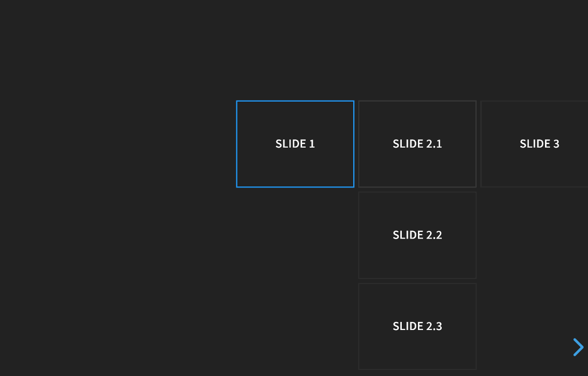
Slides can be nested within other slides to create vertical stacks (see Markup). When presenting, you use the left/right arrows to step through the main (horizontal) slides. When you arrive at a vertical stack you can optionally press the up/down arrows to view the vertical slides or skip past them by pressing the right arrow. Here's an example showing a bird's-eye view of what this looks like in action:
Navigation Mode
You can fine tune the reveal.js navigation behavior by using the navigationMode config option. Note that these options are only useful for presentations that use a mix of horizontal and vertical slides. The following navigation modes are available:
| Value | Description |
|---|---|
| default | Left/right arrow keys step between horizontal slides. Up/down arrow keys step between vertical slides. Space key steps through all slides (both horizontal and vertical). |
| linear | Removes the up/down arrows. Left/right arrows step through all slides (both horizontal and vertical). |
| grid | When this is enabled, stepping left/right from a vertical stack to an adjacent vertical stack will land you at the same vertical index. Consider a deck with six slides ordered in two vertical stacks: 1.1 2.11.2 2.21.3 2.3If you're on slide 1.3 and navigate right, you will normally move from 1.3 -> 2.1. With navigationMode set to "grid" the same navigation takes you from 1.3 -> 2.3. |
Touch Navigation
You can swipe to navigate through a presentation on any touch-enabled device. Horizontal swipes change between horizontal slides, vertical swipes change between vertical slides. If you wish to disable this you can set the touch config option to false when initializing reveal.js.
If there's some part of your content that needs to remain accessible to touch events you'll need to highlight this by adding a data-prevent-swipe attribute to the element. One common example where this is useful is elements that need to be scrolled.
Lazy Loading
When working on presentation with a lot of media or iframe content it's important to load lazily. Lazy loading means that reveal.js will only load content for the few slides nearest to the current slide. The number of slides that are preloaded is determined by the viewDistance configuration option.
To enable lazy loading all you need to do is change your src attributes to data-src as shown below. This is supported for image, video, audio and iframe elements.
<section>
  <img data-src="image.png">
  <iframe data-src="http://hakim.se"></iframe>
  <video>
    <source data-src="video.webm" type="video/webm" />
    <source data-src="video.mp4" type="video/mp4" />
  </video>
</section>
Lazy Loading Iframes
Note that lazy loaded iframes ignore the viewDistance configuration and will only load when their containing slide becomes visible. Iframes are also unloaded as soon as the slide is hidden.
When we lazy load a video or audio element, reveal.js won't start playing that content until the slide becomes visible. However there is no way to control this for an iframe since that could contain any kind of content. That means if we loaded an iframe before the slide is visible on screen it could begin playing media and sound in the background.
You can override this behavior with the data-preload attribute. The iframe below will be loaded
according to the viewDistance.
<section>
	<iframe data-src="http://hakim.se" data-preload></iframe>
</section>
You can also change the default globally with the preloadIframes configuration option. If set to
true ALL iframes with a data-src attribute will be preloaded when within the viewDistance
regardless of individual data-preload attributes. If set to false, all iframes will only be
loaded when they become visible.
API
The Reveal object exposes a JavaScript API for controlling navigation and reading state:
// Navigation
Reveal.slide( indexh, indexv, indexf );
Reveal.left();
Reveal.right();
Reveal.up();
Reveal.down();
Reveal.prev();
Reveal.next();
Reveal.prevFragment();
Reveal.nextFragment();

// Randomize the order of slides
Reveal.shuffle();

// Toggle presentation states, optionally pass true/false to force on/off
Reveal.toggleOverview();
Reveal.togglePause();
Reveal.toggleAutoSlide();

// Shows a help overlay with keyboard shortcuts, optionally pass true/false
// to force on/off
Reveal.toggleHelp();

// Change a config value at runtime
Reveal.configure({ controls: true });

// Returns the present configuration options
Reveal.getConfig();

// Fetch the current scale of the presentation
Reveal.getScale();

Reveal.getComputedSlideSize(); // Returns object with width, height keys, and (scaled) presentationWidth and presentationHeight.

// Retrieves the previous and current slide elements
Reveal.getPreviousSlide();
Reveal.getCurrentSlide();

Reveal.getIndices();        // { h: 0, v: 0, f: 0 }
Reveal.getSlidePastCount();
Reveal.getProgress();       // (0 == first slide, 1 == last slide)
Reveal.getSlides();         // Array of all slides
Reveal.getTotalSlides();    // Total number of slides

// Returns an array with all horizontal/vertical slides in the deck
Reveal.getHorizontalSlides();
Reveal.getVerticalSlides();

// Checks if the presentation contains two or more
// horizontal/vertical slides
Reveal.hasHorizontalSlides();
Reveal.hasVerticalSlides();

// Returns the speaker notes for the current slide
Reveal.getSlideNotes();

// State checks
Reveal.isFirstSlide();
Reveal.isLastSlide();
Reveal.isOverview();
Reveal.isPaused();
Reveal.isAutoSliding();

// Returns the top-level DOM element
Reveal.getRevealElement(); // <div class="reveal">...</div>
Custom Key Bindings
Custom key bindings can be added and removed using the following Javascript API. Custom key bindings will override the default keyboard bindings, but will in turn be overridden by the user defined bindings in the keyboard config option.
Reveal.addKeyBinding( binding, callback );
Reveal.removeKeyBinding( keyCode );
For example
// The binding parameter provides the following properties
//      keyCode: the keycode for binding to the callback
//          key: the key label to show in the help overlay
//  description: the description of the action to show in the help overlay
Reveal.addKeyBinding( { keyCode: 84, key: 'T', description: 'Start timer' }, function() {
	// start timer
} )

// The binding parameter can also be a direct keycode without providing the help description
Reveal.addKeyBinding( 82, function() {
	// reset timer
} )
This allows plugins to add key bindings directly to Reveal so they can
- make use of Reveal's pre-processing logic for key handling (for example, ignoring key presses when paused); and
- be included in the help overlay (optional)
Slide Changed Event
A slidechanged event is fired each time the slide is changed (regardless of state). The event object holds the index values of the current slide as well as a reference to the previous and current slide HTML nodes.
Some libraries, like MathJax (see #226), get confused by the transforms and display states of slides. Often times, this can be fixed by calling their update or render function from this callback.
Reveal.addEventListener( 'slidechanged', function( event ) {
	// event.previousSlide, event.currentSlide, event.indexh, event.indexv
} );
Presentation State
The presentation's current state can be fetched by using the getState method. A state object contains all of the information required to put the presentation back as it was when getState was first called. Sort of like a snapshot. It's a simple object that can easily be stringified and persisted or sent over the wire.
Reveal.slide( 1 );
// we're on slide 1

var state = Reveal.getState();

Reveal.slide( 3 );
// we're on slide 3

Reveal.setState( state );
// we're back on slide 1
Slide States
If you set data-state="somestate" on a slide <section>, "somestate" will be applied as a class on the document element when that slide is opened. This allows you to apply broad style changes to the page based on the active slide.
Furthermore you can also listen to these changes in state via JavaScript:
Reveal.addEventListener( 'somestate', function() {
	// TODO: Sprinkle magic
}, false );
Slide Backgrounds
Slides are contained within a limited portion of the screen by default to allow them to fit any display and scale uniformly. You can apply full page backgrounds outside of the slide area by adding a data-background attribute to your <section> elements. Four different types of backgrounds are supported: color, image, video and iframe.
Color Backgrounds
All CSS color formats are supported, including hex values, keywords, rgba() or hsl().
<section data-background-color="#ff0000">
	<h2>Color</h2>
</section>
Image Backgrounds
By default, background images are resized to cover the full page. Available options:
| Attribute | Default | Description |
|---|---|---|
| data-background-image | URL of the image to show. GIFs restart when the slide opens. | |
| data-background-size | cover | See background-size on MDN. |
| data-background-position | center | See background-position on MDN. |
| data-background-repeat | no-repeat | See background-repeat on MDN. |
| data-background-opacity | 1 | Opacity of the background image on a 0-1 scale. 0 is transparent and 1 is fully opaque. |
<section data-background-image="http://example.com/image.png">
	<h2>Image</h2>
</section>
<section data-background-image="http://example.com/image.png" data-background-size="100px" data-background-repeat="repeat">
	<h2>This background image will be sized to 100px and repeated</h2>
</section>
Video Backgrounds
Automatically plays a full size video behind the slide.
| Attribute | Default | Description |
|---|---|---|
| data-background-video | A single video source, or a comma separated list of video sources. | |
| data-background-video-loop | false | Flags if the video should play repeatedly. |
| data-background-video-muted | false | Flags if the audio should be muted. |
| data-background-size | cover | Use cover for full screen and some cropping or contain for letterboxing. |
| data-background-opacity | 1 | Opacity of the background video on a 0-1 scale. 0 is transparent and 1 is fully opaque. |
<section data-background-video="https://s3.amazonaws.com/static.slid.es/site/homepage/v1/homepage-video-editor.mp4,https://s3.amazonaws.com/static.slid.es/site/homepage/v1/homepage-video-editor.webm" data-background-video-loop data-background-video-muted>
	<h2>Video</h2>
</section>
Iframe Backgrounds
Embeds a web page as a slide background that covers 100% of the reveal.js width and height. The iframe is in the background layer, behind your slides, and as such it's not possible to interact with it by default. To make your background interactive, you can add the data-background-interactive attribute.
<section data-background-iframe="https://slides.com" data-background-interactive>
	<h2>Iframe</h2>
</section>
Iframes are lazy-loaded when they become visible. If you'd like to preload iframes ahead of time, you can append a data-preload attribute to the slide <section>. You can also enable preloading globally for all iframes using the preloadIframes configuration option.
Background Transitions
Backgrounds transition using a fade animation by default. This can be changed to a linear sliding transition by passing backgroundTransition: 'slide' to the Reveal.initialize() call. Alternatively you can set data-background-transition on any section with a background to override that specific transition.
Parallax Background
If you want to use a parallax scrolling background, set the first two properties below when initializing reveal.js (the other two are optional).
Reveal.initialize({

	// Parallax background image
	parallaxBackgroundImage: '', // e.g. "https://s3.amazonaws.com/hakim-static/reveal-js/reveal-parallax-1.jpg"

	// Parallax background size
	parallaxBackgroundSize: '', // CSS syntax, e.g. "2100px 900px" - currently only pixels are supported (don't use % or auto)

	// Number of pixels to move the parallax background per slide
	// - Calculated automatically unless specified
	// - Set to 0 to disable movement along an axis
	parallaxBackgroundHorizontal: 200,
	parallaxBackgroundVertical: 50

});
Make sure that the background size is much bigger than screen size to allow for some scrolling. View example.
Slide Transitions
The global presentation transition is set using the transition config value. You can override the global transition for a specific slide by using the data-transition attribute:
<section data-transition="zoom">
	<h2>This slide will override the presentation transition and zoom!</h2>
</section>

<section data-transition-speed="fast">
	<h2>Choose from three transition speeds: default, fast or slow!</h2>
</section>
You can also use different in and out transitions for the same slide:
<section data-transition="slide">
    The train goes on …
</section>
<section data-transition="slide">
    and on …
</section>
<section data-transition="slide-in fade-out">
    and stops.
</section>
<section data-transition="fade-in slide-out">
    (Passengers entering and leaving)
</section>
<section data-transition="slide">
    And it starts again.
</section>
You can choose from none, fade, slide, convex, concave and zoom.
Internal links
It's easy to link between slides. The first example below targets the index of another slide whereas the second targets a slide with an ID attribute (<section id="some-slide">):
<a href="#/2/2">Link</a>
<a href="#/some-slide">Link</a>
You can also add relative navigation links, similar to the built in reveal.js controls, by appending one of the following classes on any element. Note that each element is automatically given an enabled class when it's a valid navigation route based on the current slide.
<a href="#" class="navigate-left">
<a href="#" class="navigate-right">
<a href="#" class="navigate-up">
<a href="#" class="navigate-down">
<a href="#" class="navigate-prev"> <!-- Previous vertical or horizontal slide -->
<a href="#" class="navigate-next"> <!-- Next vertical or horizontal slide -->
Fragments
Fragments are used to highlight individual elements on a slide. Every element with the class fragment will be stepped through before moving on to the next slide. Here's an example: http://revealjs.com/#/fragments
The default fragment style is to start out invisible and fade in. This style can be changed by appending a different class to the fragment:
<section>
	<p class="fragment grow">grow</p>
	<p class="fragment shrink">shrink</p>
	<p class="fragment fade-out">fade-out</p>
	<p class="fragment fade-up">fade-up (also down, left and right!)</p>
	<p class="fragment fade-in-then-out">fades in, then out when we move to the next step</p>
	<p class="fragment fade-in-then-semi-out">fades in, then obfuscate when we move to the next step</p>
	<p class="fragment highlight-current-blue">blue only once</p>
	<p class="fragment highlight-red">highlight-red</p>
	<p class="fragment highlight-green">highlight-green</p>
	<p class="fragment highlight-blue">highlight-blue</p>
</section>
Multiple fragments can be applied to the same element sequentially by wrapping it, this will fade in the text on the first step and fade it back out on the second.
<section>
	<span class="fragment fade-in">
		<span class="fragment fade-out">I'll fade in, then out</span>
	</span>
</section>
The display order of fragments can be controlled using the data-fragment-index attribute.
<section>
	<p class="fragment" data-fragment-index="3">Appears last</p>
	<p class="fragment" data-fragment-index="1">Appears first</p>
	<p class="fragment" data-fragment-index="2">Appears second</p>
</section>
Fragment events
When a slide fragment is either shown or hidden reveal.js will dispatch an event.
Some libraries, like MathJax (see #505), get confused by the initially hidden fragment elements. Often times this can be fixed by calling their update or render function from this callback.
Reveal.addEventListener( 'fragmentshown', function( event ) {
	// event.fragment = the fragment DOM element
} );
Reveal.addEventListener( 'fragmenthidden', function( event ) {
	// event.fragment = the fragment DOM element
} );
Code Syntax Highlighting
By default, Reveal is configured with highlight.js for code syntax highlighting. To enable syntax highlighting, you'll have to load the highlight plugin (plugin/highlight/highlight.js) and a highlight.js CSS theme (Reveal comes packaged with the Monokai themes: lib/css/monokai.css).
Reveal.initialize({
	// More info https://github.com/hakimel/reveal.js#dependencies
	dependencies: [
		{ src: 'plugin/highlight/highlight.js', async: true },
	]
});
Below is an example with clojure code that will be syntax highlighted. When the data-trim attribute is present, surrounding whitespace is automatically removed. HTML will be escaped by default. To avoid this, for example if you are using <mark> to call out a line of code, add the data-noescape attribute to the <code> element.
<section>
	<pre><code data-trim data-noescape>
(def lazy-fib
  (concat
   [0 1]
   <mark>((fn rfib [a b]</mark>
        (lazy-cons (+ a b) (rfib b (+ a b)))) 0 1)))
	</code></pre>
</section>
Line Numbers & Highlights
To enable line numbers, add data-line-numbers to your <code> tags. If you want to highlight specific lines you can provide a comma separated list of line numbers using the same attribute. For example, in the following example lines 4 and 8-11 are highlighted:
<pre><code class="hljs" data-line-numbers="4,8-11">
import React, { useState } from 'react';

function Example() {
  const [count, setCount] = useState(0);

  return (
    <div>
      <p>You clicked {count} times</p>
      <button onClick={() => setCount(count + 1)}>
        Click me
      </button>
    </div>
  );
}
</code></pre>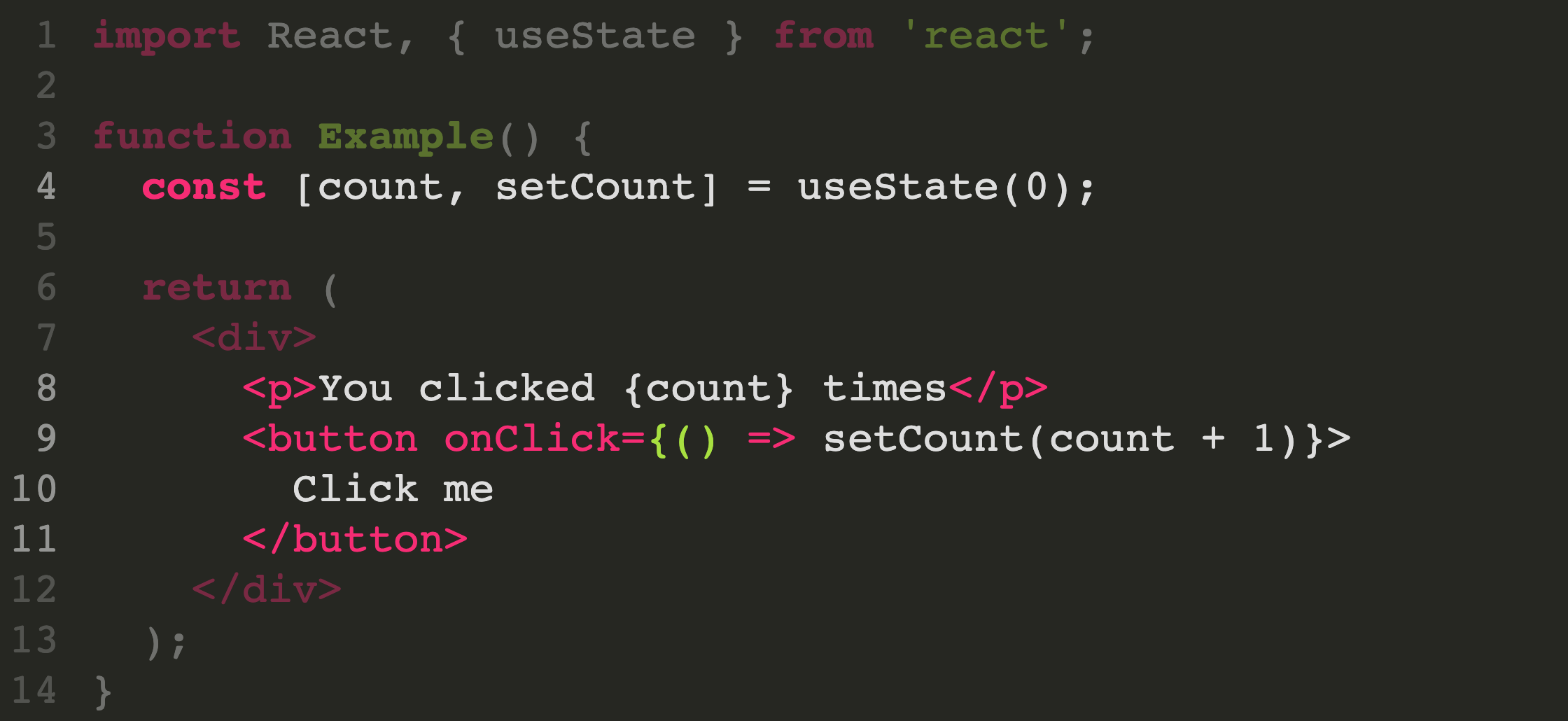
Step-by-step Highlights
You can step through multiple code highlights on the same code block. Delimit each of your highlight steps with the | character. For example data-line-numbers="1|2-3|4,6-10" will produce three steps. It will start by highlighting line 1, next step is lines 2-3, and finally line 4 and 6 through 10.
Slide number
If you would like to display the page number of the current slide you can do so using the slideNumber and showSlideNumber configuration values.
// Shows the slide number using default formatting
Reveal.configure({ slideNumber: true });

// Slide number formatting can be configured using these variables:
//  "h.v": 	horizontal . vertical slide number (default)
//  "h/v": 	horizontal / vertical slide number
//    "c": 	flattened slide number
//  "c/t": 	flattened slide number / total slides
Reveal.configure({ slideNumber: 'c/t' });

// You can provide a function to fully customize the number:
Reveal.configure({ slideNumber: function( slide ) {
    // Ignore numbering of vertical slides
    return [ Reveal.getIndices( slide ).h ];
}});

// Control which views the slide number displays on using the "showSlideNumber" value:
//     "all": show on all views (default)
// "speaker": only show slide numbers on speaker notes view
//   "print": only show slide numbers when printing to PDF
Reveal.configure({ showSlideNumber: 'speaker' });
Overview mode
Press »ESC« or »O« keys to toggle the overview mode on and off. While you're in this mode, you can still navigate between slides, as if you were at 1,000 feet above your presentation. The overview mode comes with a few API hooks:
Reveal.addEventListener( 'overviewshown', function( event ) { /* ... */ } );
Reveal.addEventListener( 'overviewhidden', function( event ) { /* ... */ } );

// Toggle the overview mode programmatically
Reveal.toggleOverview();